

Interior Painting Tips: How to Choose the Perfect Color for Every Room

Choosing paint colors is one of those things that seems straightforward until you're actually standing in front of 200 paint swatches at the hardware store, completely overwhelmed and wondering why there are seventeen different shades of white.
I've been doing interior painting work across Somerset County for years, and I've seen every mistake in the book. Rooms painted dark blue, like caves. Trendy colors that looked brilliant in the magazine but terrible in real life. Colors that looked perfect on the sample card but were completely different on the actual wall.
Let's talk about how to actually choose colors that work, room by room, without the guesswork and stress. This isn't about following rigid rules or sticking to safe beige everything. It's about understanding what makes colors work so you can make choices you'll be happy with for years to come.
Understanding Color Basics (Without Getting Too Technical)
Before we get into specific rooms, it helps to understand a bit about how color actually works.
Undertones Are Everything
Here's what trips people up more than anything else: every paint color has an undertone. A white might look clean and neutral on the card, but it's actually got blue, yellow, pink, or grey undertones that become obvious once it's on your wall.
Those undertones interact with everything else in the room – your flooring, your furniture, the natural light coming in. A white with yellow undertones looks lovely and warm in a room with oak floors and afternoon sun. Put that same white in a room with grey carpet and north-facing windows, and it looks dingy and sallow.
Grey is particularly tricky because there are warm greys (with brown or beige undertones), cool greys (with blue undertones), and everything in between. A grey that looks perfect in your mate's house might look completely different in yours because the undertones react differently to your specific lighting and furnishings.
The way to spot undertones is to compare colors side by side. Put a "warm white" next to a "cool white," and you'll see one looks creamy or peachy while the other looks crisp or slightly blue. Once you train your eye to see undertones, choosing colors gets much easier.
Light Changes Everything
Paint colors look completely different depending on the light. A color that looks bright and cheerful at midday might look dull and flat under artificial lighting at night. Colors also change dramatically based on which direction the room faces.
South-facing rooms get lovely warm, bright light throughout the day. Almost any color works in south-facing rooms because the light is so good. These rooms can handle darker or bolder colors that might feel oppressive elsewhere.
East-facing rooms get bright, slightly cool morning light, then indirect light for the rest of the day. West-facing rooms are dim in the morning but get strong, warm afternoon and evening light.
This is why you absolutely must test paint colors in the actual room, at different times of day, before committing. Those little paint cards under fluorescent shop lighting tell you almost nothing about how the color will actually look.
Colors for Different Rooms
Right, let's get into the specific considerations for different rooms in your home. Each space has different needs based on how it's used, what mood you want, and practical considerations like moisture or wear.
Living Rooms and Lounges
The living room is usually where you spend the most time and where guests see first, so getting this right matters. The good news is living rooms are relatively forgiving – you've got flexibility here that you don't have in, say, bathrooms.
For living rooms, I generally steer people toward relatively neutral colors with enough personality to avoid being boring. Soft greys, warm beiges, gentle blues, or muted greens all work brilliantly. These colors create a calm, welcoming backdrop that works with various furniture styles and can easily be updated with different accessories.
If you want more color, consider using it on just one wall as an accent – maybe behind the television or sofa. A deeper blue, rich green, or even a terracotta or burgundy accent wall adds interest without overwhelming the space.
The living room needs to work from morning to night under different lighting conditions. Test your colors under both natural daylight and your evening lighting. Some colors that look lovely during the day can feel flat or odd under artificial light.
Kitchens
Kitchens have specific practical needs that affect color choices. They need to feel clean, which is why white and light colors have traditionally dominated. But that doesn't mean you're stuck with boring white walls.
Soft greys are brilliant in modern kitchens, especially with white cabinets and stainless steel appliances. Just watch the undertones – you want greys that lean slightly warm rather than cold blues.
Pale blue is a classic kitchen color that feels fresh and clean while adding a bit of personality. Duck egg blue, powder blue, or soft aqua all work well. These colors have the bonus of being appetite-friendly – blues are calming and won't make you feel overwhelmed when you're cooking.
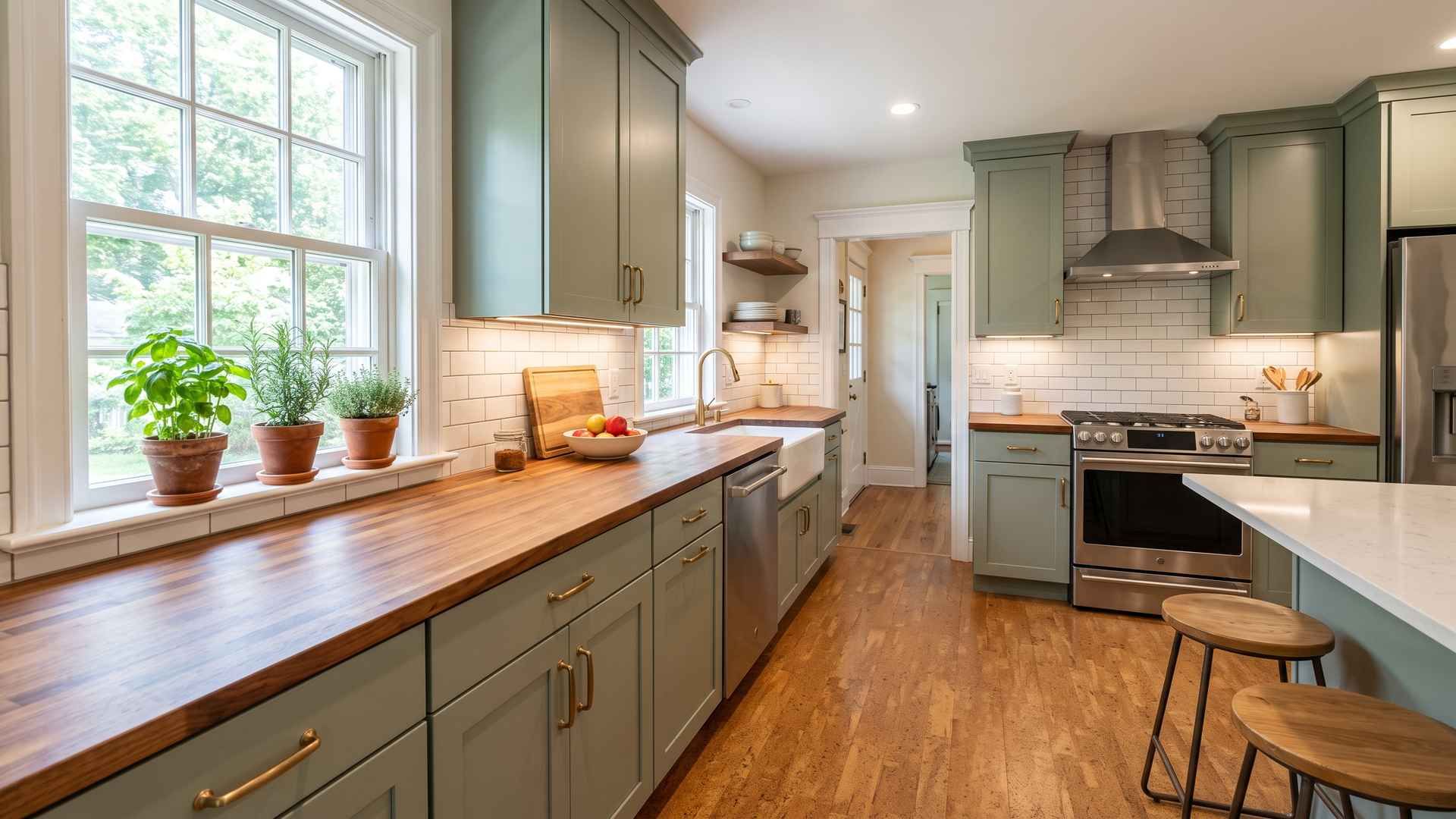
Soft greens, particularly sage or mint tones, work beautifully in kitchens. Green is associated with freshness and nature, which suits the kitchen environment. These colors work especially well in country-style or traditional kitchens.
Remember that kitchens get dirty. Flat or matte finishes show every splatter and smudge. Use satin or semi-gloss finishes in kitchens – they're more durable and easier to clean.
Bedrooms
Bedrooms are personal spaces where comfort and relaxation matter most. This is where you can be more experimental because it's not a space guests typically see.
For main bedrooms, softer, calming colors generally work best. Blues are the classic bedroom color because they're proven to be calming and conducive to sleep. Soft blue-greys, powder blues, or deeper slate blues all create restful environments.
Greens are equally calming, particularly muted sages, soft mints, or grey-greens. Green is psychologically associated with nature and tranquility, making it ideal for bedrooms.
Warm neutrals like taupe, greige (grey-beige), or soft mushroom create cozy, comfortable bedrooms without being as stark as pure white or grey.
If you want warmer tones, soft blush pinks, warm terracotta, or muted coral can create cozy, welcoming bedrooms. These colors work particularly well in rooms with lots of natural light.
For children's bedrooms, the temptation is to go bright and bold, but remember you'll be reading bedtime stories in there. Softer versions of whatever colors they love work better than intense primaries. A child who loves blue might be better served by a soft sky blue than by a bright primary blue, which is stimulating rather than calming.
Bathrooms
Bathrooms have unique challenges. They're typically small, often windowless or with limited natural light, and they deal with moisture and humidity.
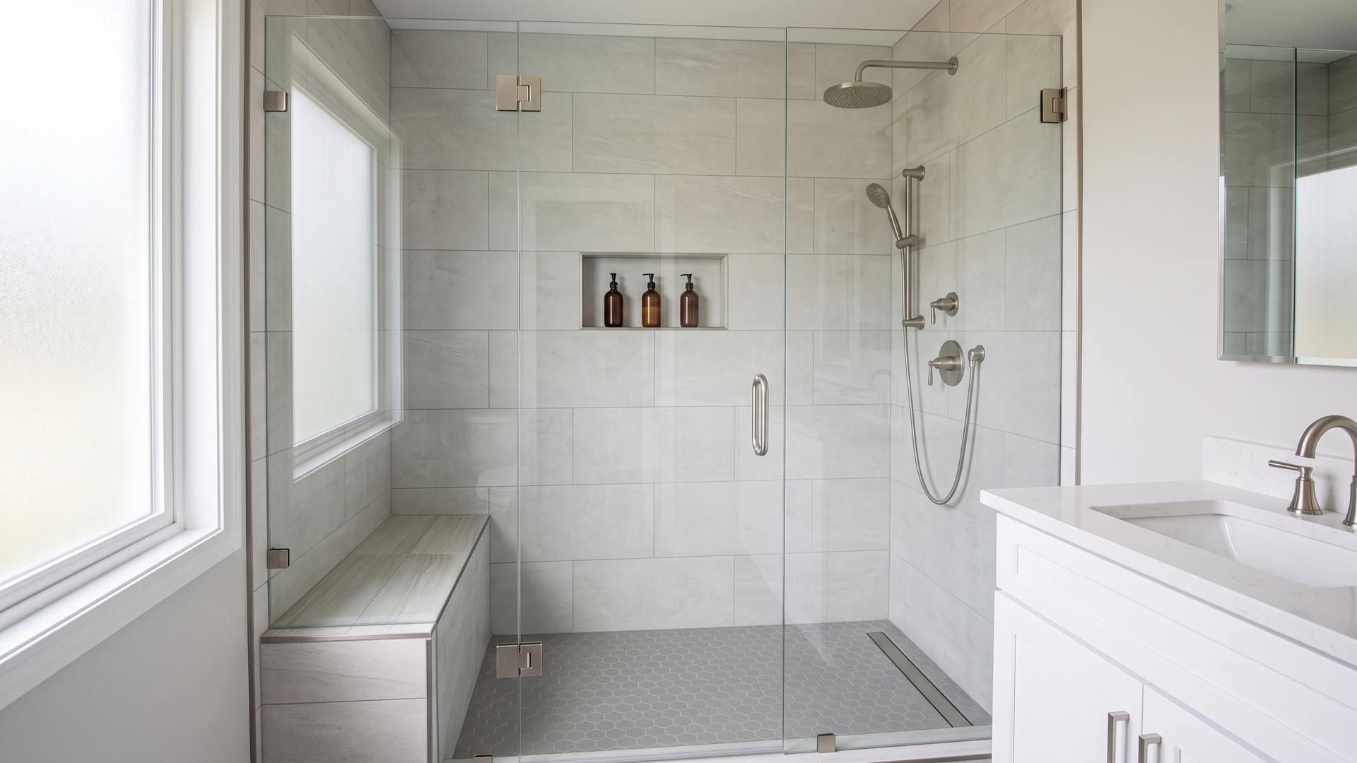
Light colors are usually best in bathrooms because they make small spaces feel larger and help compensate for limited natural light. Whites, soft greys, pale blues, and light greens are all bathroom classics for good reason.
Pale blues and aquas are particularly suitable for bathrooms because they're associated with water and cleanliness. These colors feel fresh and spa-like.
If your bathroom has good natural light and a decent size, you can go darker or bolder. Deep navy, charcoal grey, or even black in a bathroom can look stunning and sophisticated, particularly with white fixtures and good lighting.
Avoid flat or matte finishes in bathrooms. The humidity and potential for mold mean you need satin, semi-gloss, or gloss finishes. These finishes resist moisture better and are easier to clean.
Consider using different colors for different areas if you've got a larger bathroom. You might do the main walls in a soft grey, but paint the area behind the mirror in a complementary, darker shade or interesting tile pattern.
The ceiling in bathrooms deserves thought. Standard white ceilings can feel stark. Consider painting the ceiling the same color as the walls, but a few shades lighter, to create a cohesive, spa-like feel.
Hallways and Stairs
Hallways are transition spaces that connect other rooms, which present both challenges and opportunities. They're often narrow and poorly lit, but they're also the first thing you see when you enter the home.
Light colors are generally best for narrow hallways because they make the space feel more open. Warm whites, soft greys, or pale neutrals create a welcoming entrance without making the space feel cramped.
If your hallway is wide and well-lit, you can go bolder. A rich color on hallway walls can create drama and make adjoining rooms feel larger by contrast. Deep blues, forest greens, or even dark greys work well.
Stairs are similar to hallways in that they need careful color choices. Light colors make narrow staircases feel more open. If you've got a grand staircase with good natural light, darker colors can look impressive.
The practical consideration with hallways and stairs is durability. These are high-traffic areas that get touched frequently. Use more durable satin or semi-gloss finishes rather than flat matte.
Home Offices
With more people working from home, getting the home office color right matters for both productivity and comfort.
The ideal office color balances being stimulating enough to keep you focused but not so energizing that it's tiring to be in all day. This is a tricky balance.
Soft blues and greens are brilliant for offices because they're calming without being sleepy. These colors help with focus and concentration without causing fatigue.
Neutral greys, particularly warmer greys with slight brown undertones, create professional-looking offices that aren't distracting. They're good backgrounds for video calls too.
Testing Colors Properly
Right, this is where most people get it wrong. They choose a color based on a tiny paint card under shop lighting, paint the whole room, and then discover it looks completely different from what they expected.
Paint at least two coats because the color changes between coats. Let it dry completely – wet paint looks darker than dry paint.
Look at your samples at different times of day. Check them in morning light, afternoon light, and evening under your artificial lighting. Colors can look dramatically different depending on the light.
Look at your samples from different positions in the room. A color might look perfect when you're standing in the doorway, but completely different from where you'll actually be sitting.
Compare your samples against your existing furnishings, flooring, and any elements that aren't changing. Make sure the undertones work together rather than clashing.
Live with your samples for at least a few days before deciding. Your initial reaction might change once you've seen the color in different conditions.
If you're torn between a few colors, paint them on the same wall side by side. This makes comparison much easier than having samples on different walls.
Common Mistakes to Avoid
Let me tell you about the mistakes I see constantly in my painting work around Somerset County.
Choosing colors in isolation. People pick colors without considering what's already in the room – the flooring, the furniture, the fixtures. Then they're surprised when the new wall color clashes with everything else.
Being swayed by trends. That trendy color you saw in every magazine might be dated in two years. Choose colors you genuinely like that work with your home, not whatever is fashionable at the moment.
Going too matchy. Having every room the same neutral might seem safe, but it's boring and makes your home feel like a rental property. It's fine for rooms to have different colors – just make sure they complement each other.
Going too bold everywhere. Having every room painted a different bright color is exhausting. Bold color works best as an accent, not throughout the entire house.
Ignoring the ceiling. People automatically paint ceilings builder's white without thinking. Sometimes that works, but often painting the ceiling the same color as the walls (or a lighter version) creates a more cohesive, finished look.
Skipping proper preparation. Paint applied over dirty walls, flaky old paint, or without proper primer looks terrible, no matter what color you choose. Proper prep is what makes a paint job look professional rather than shabby.
Professional Painting vs DIY
Let's be honest about when DIY makes sense and when it's worth hiring professionals like us at Jeff's Home Improvement.
Painting a simple bedroom or living room yourself is perfectly doable if you're reasonably handy and have the time. Buy quality materials, take your time with the prep work, and you can achieve decent results.
But some situations really call for professional painters. High ceilings or stairwells are difficult and dangerous to do yourself. Multiple rooms or whole-house painting is exhausting and time-consuming – what takes you three weekends takes us two or three days, and we do the prep and cleanup properly.
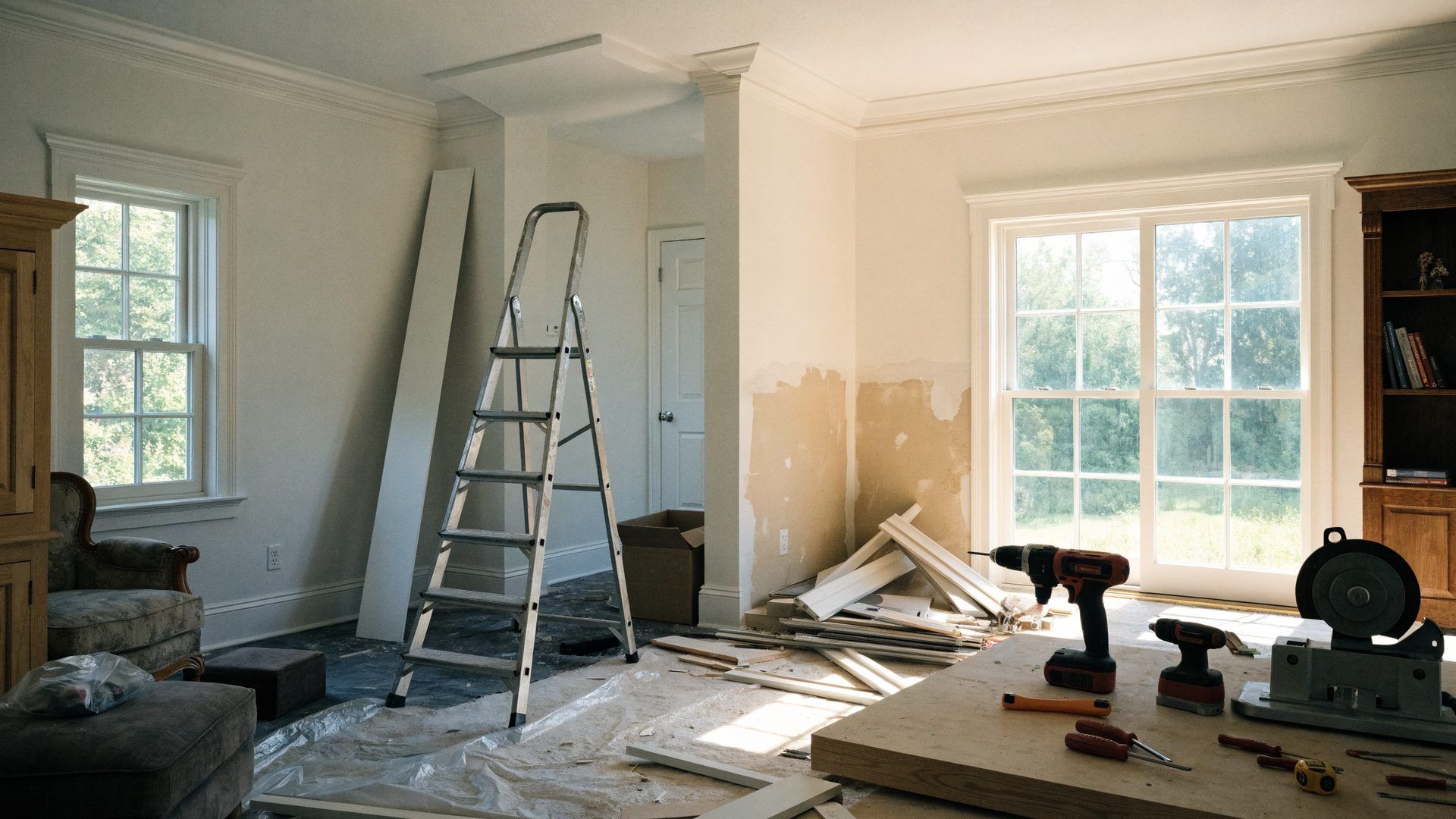
Older homes with plaster walls often need repairs and proper preparation before painting. If you don't know what you're doing, you can make things worse. Textured finishes, feature walls, or any kind of decorative painting technique requires skill and experience.
The other consideration is time and stress. Your time has value. If you'd spend three weekends painting when you could be doing other things, and the professional job costs less than what you'd earn in those three weekends, hiring professionals makes financial sense.
We've done thousands of painting jobs across Basking Ridge, Hillsborough, Bedminster, and throughout Somerset County. We know the common problems in older homes around here. We spot issues such as moisture damage, poor prior repairs, or structural problems that need to be addressed before painting. We have the proper equipment for high ceilings and tricky areas. And we warranty our work – if there's a problem, we put it right.
We also handle all the related work that often accompanies painting projects – repairing damaged plaster, fixing trim, addressing water damage, or coordinating with other home improvement work you might be doing simultaneously.
Preparation Is Everything
Whether you're painting yourself or hiring us, the preparation is what separates a paint job that looks good from one that looks professional.
Walls need to be clean and free of grease, dust, and other contaminants that prevent paint from adhering. We wash walls with sugar soap solution, particularly in kitchens where grease accumulates.
Loose or flaking old paint needs to be scraped off, and the edges feathered smooth. You can't just paint over failing paint – it'll fail again almost immediately.
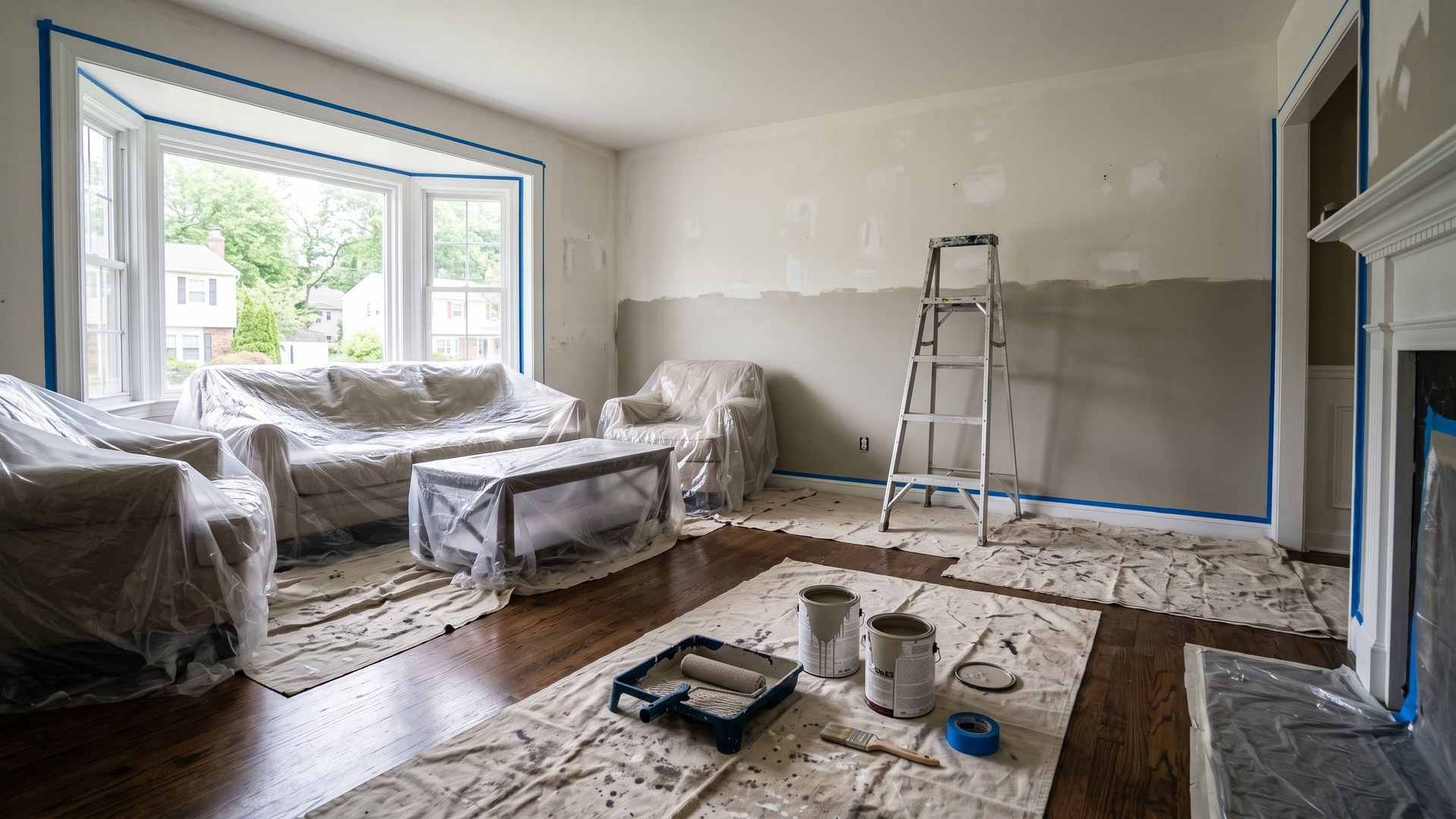
Trim, sockets, and switches get masked off with proper decorator's tape. Floors and furniture get covered with heavy-duty dust sheets, not those flimsy plastic ones that slip around.
Only after all this preparation do we actually start applying finish coats. And even then, we apply at least two coats because one coat never provides adequate coverage or durability.
Color Psychology (Without the Nonsense)
There's a lot of rubbish talked about color psychology, but there are some genuine effects worth considering.
Blues really are calming. Studies consistently show blue environments reduce heart rate and promote relaxation. This makes blue suitable for bedrooms, bathrooms, or anywhere you want a calm atmosphere.
Greens are calming too, associated with nature and tranquility. Green is easy on the eyes and doesn't cause fatigue, making it a good choice for offices or any room where you spend a lot of time.
Reds are energizing and stimulating. They actually slightly increase heart rate and blood pressure. Small amounts of red can add warmth and vibrancy, but too much becomes overwhelming or even aggressive.
Neutrals don't have strong psychological effects, which is part of their appeal – they're blank canvases that take on the mood created by furnishings, lighting, and accessories.
Don't overthink this. Your own response to colors matters more than general trends. If you love a color and it makes you happy, that psychological effect is more important than what studies say about it.
Working With What You've Got
Sometimes you can't change everything in a room, and your paint color needs to work with existing elements.
If you've got flooring you're keeping, your wall color needs to complement it. Warm-toned wood floors work with warm wall colors. Cool grey floors work with cooler wall tones. Busy patterned carpets need simpler wall colors.
Fixed elements like kitchen cabinets or bathroom tiles dictate your color choices to some extent. If you've got dated pink bathroom tiles you're not replacing, embrace them with complementary grey or white walls rather than fighting them with clashing colors.
The furniture you're keeping affects your choices, too. If you've got a large dark wood dresser that's staying put, consider how wall colors will look against it.
Natural light, which you can't change,e is perhaps the biggest constraint. A north-facing room with limited light needs a different color treatment than a bright south-facing room.
Getting Help When You Need It
If you're genuinely stuck choosing colors, there's no shame in getting professional help. Interior designers charge for color consultations, but if you're doing a whole house, it's money well spent.
Many paint shops offer free color consultation services. The quality varies, but it doesn't hurt to ask for advice.
We've worked on hundreds of homes around Basking Ridge, Bedminster, Hillsborough, and the rest of Somerset County. We've seen what works in different home styles and lighting conditions. We're always happy to offer advice on which colors tend to work well in specific situations, even if it's just pointing you away from choices that probably won't.
The most important thing is choosing colors you'll be happy living with for years. Trends come and go. What matters is whether you genuinely like the colors and they work in your specific home.
FAQs: Interior Painting Tips NJ
How can I make a small room look bigger with paint color choices?
Several paint strategies genuinely do make small rooms feel more spacious. Light colors reflect more light and create an airy feeling, so whites, soft greys, pale blues, and other light shades are your best bet for making a small room feel larger. But it's not just about using any light color – you need to think about the whole room. Painting the ceiling the same color as the walls, or just a shade lighter, eliminates the visual break that makes the room feel more enclosed. When the walls and ceiling blend, the eye doesn't stop at the corners, which makes the space feel more open. Using the same color throughout the room rather than different colors on different walls also helps – multiple colors in a small space breaks it up visually and makes it feel smaller. If you want to add interest, use different shades of the same color rather than completely different colors.
What's the best way to choose paint colors that will work with furniture and decor I already own?
Working with existing furniture and decor is actually easier than starting from scratch because you have concrete elements to work with rather than an infinite number of possibilities. Start by identifying the dominant colors in your existing pieces. Lay out samples of your furniture fabrics, look at your rugs and curtains, and identify the main colors and undertones. Most furnished rooms have a color palette already – you just need to identify it and choose wall colors that complement it. Take photographs of your room with your existing furniture and view them on your phone or computer – sometimes seeing things in photos makes color relationships clearer. When testing paint colors, look at the samples directly next to your existing furniture pieces, particularly larger items like sofas or cabinets that dominate the room.
How often should rooms be repainted, and what are the signs it's time for fresh paint?
How often rooms need repainting depends on several factors – the room's use, the quality of the original paint job, and how well the walls have been maintained. Generally speaking, bedrooms and formal living areas that see light use can go 5-7 years or longer before needing repainting if they were painted properly with quality paint. Kids' rooms, bathrooms, and kitchens typically need repainting every 3-5 years because they get more wear and tear, moisture exposure, and general abuse. Hallways, stairs, and entryways might need more frequent touch-ups because they're high-traffic areas where walls get bumped and scuffed, though full repainting might only be needed every 5 years or so. The signs that it's time to repaint are fairly obvious once you know what to look for. Fading is common, particularly on walls that get direct sunlight – if the color looks noticeably lighter or different than it did originally, it's time. Scuff marks, scratches, and general dirt that won't wash off indicate that the paint surface is damaged and needs to be renewed. Cracking or alligatoring (where paint develops a scaly, reptile-skin appearance) indicates old, deteriorated paint that's past its useful life. If the walls look dingy or dull even after cleaning, the paint has worn out and lost its finish. Texture changes where the paint has become rough or uneven suggest it's breaking down. If you're seeing several of these signs, it's definitely time to repaint.
Final Thoughts
Choosing paint colors doesn't need to be stressful. Yes, there are lots of options, and yes, colors look different once they're actually on the wall. But if you understand the basics of how light affects color, test thoroughly before committing, and consider how each room functions, you'll make choices that work.
The rooms we spend most time in deserve the most thought. Get the living room and bedroom colors right, and you'll appreciate them every day. The guest bathroom you rarely use matters less – if you're not entirely happy with the color, it matters less because you're barely in there.
If you're in Somerset County and thinking about interior painting, whether it's one room or the whole house, we're happy to help. We can offer advice on colors, handle all the prep and painting work, and make the whole process much less stressful than doing it yourself.
Give us a call at 908-963-3533 or email jeffofalltradeshandymanservice@gmail.com. No obligation, no pressure – just honest advice about what would work for your home. We've been doing this work around Basking Ridge, Bedminster, Bernardsville, Warren, Far Hills, Gladstone, and Hillsborough for years, and we'd be happy to help with your project too.